


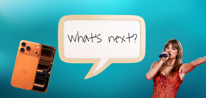
Apple’s product launches are usually a spectacle of innovation with sleek new designs, cutting-edge features, and subtle marketing genius. This week’s iPhone 17 announcement was no exception. Tim Cook took the stage to showcase a lineup that promised faster performance, longer battery life, and refined aesthetics. But in true pop culture fashion, the conversation quickly shifted elsewhere. Fans everywhere, especially Swifties, are buzzing over one peculiar detail: the colors.
Could Apple’s new palette be more than just an aesthetic choice? Could it be a subtle nod to Taylor Swift and her upcoming album, The Life of a Showgirl, set to release on October 3?
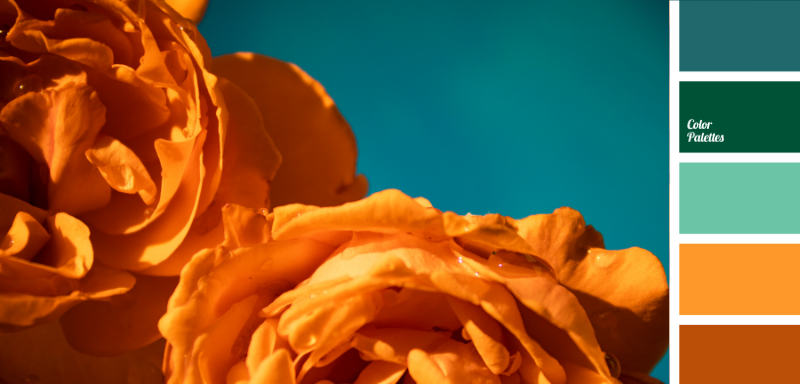
A Color Palette That Tells a Story
Look closely, and it’s hard to ignore the parallels:
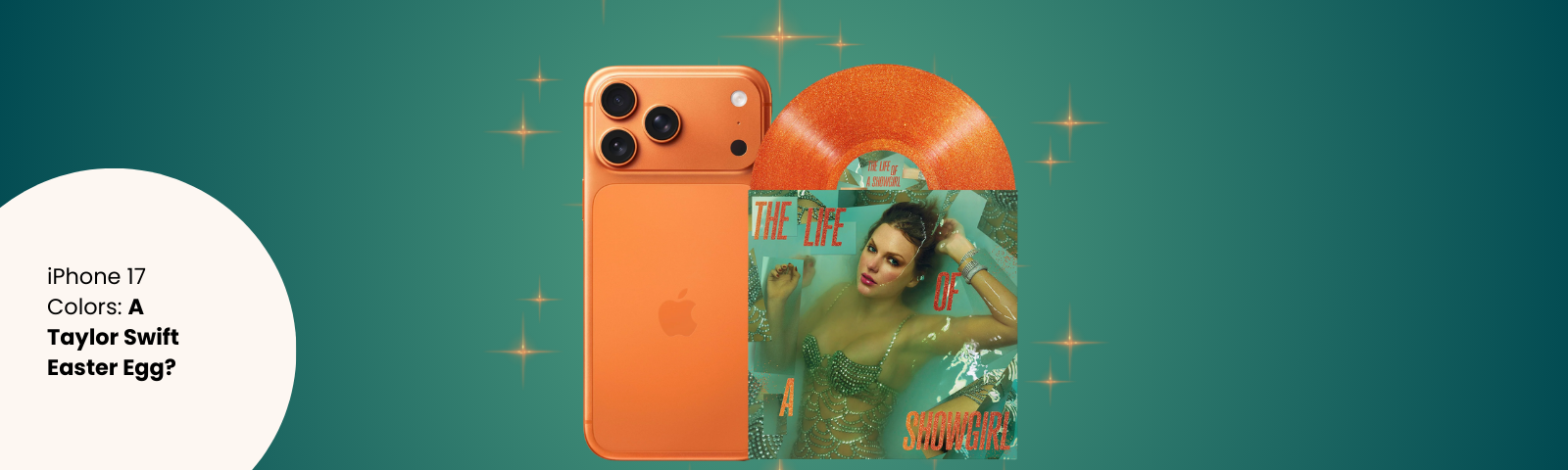
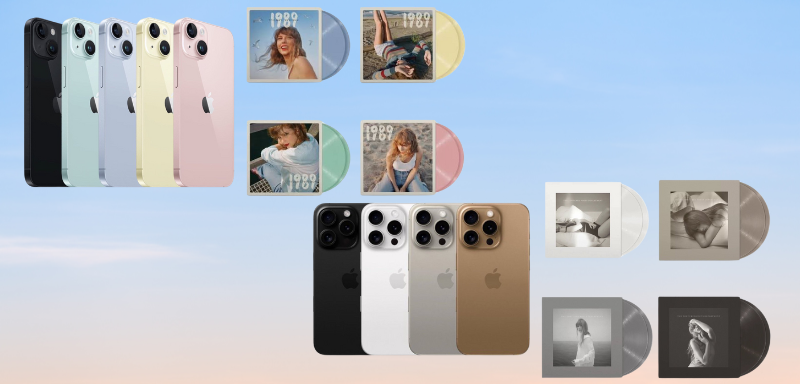
- Cosmic Orange is bold, daring, and unapologetically vibrant, perfectly aligned with the theatrical energy Taylor has teased for her next era.
- Mist Blue recalls the airy, dreamlike tones of 1989, one of her defining pop moments.
- Lavender feels like a love letter to Speak Now and the sultry, secretive vibe of Lavender Haze, a shade that’s as soft as it is emotionally charged.
- Sage brings to mind the introspective, earthy textures of Folklore, where vulnerability and subtle resilience meet.
Even the iPhone Air’s Frost and Shadow colors are stirring conversation online. Fans are quick to point out how these could represent the balance between light and dark themes, a motif Taylor has woven into her lyrics and visuals.
A Pattern Fans Love to Connect
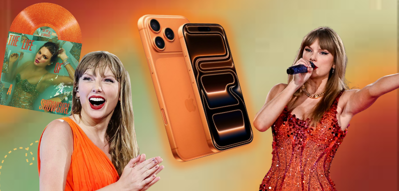
The moment the iPhone 17 Pro’s Cosmic Orange was revealed, one thought raced through the minds of fans everywhere: Is that Life of a Showgirl orange? Social media lit up. On Threads, one user declared, “yo, Taylor Swift left us clues for iphone 17 pro.” Another wrote, “Apple just introduced the iphone 17 pro taylors version.” A third chimed in, “Apple just entered its showgirl era.”
For fans, spotting patterns between album aesthetics and tech launches isn’t new. Swift’s visual storytelling has often coincided with broader trends, and Apple’s color choices have, in the past, felt eerily aligned with the moods and palettes she embraces. Some Swifties are convinced this is more than coincidence and it’s code waiting to be cracked.
Happy Coincidence or Strategic Move?
It’s entirely possible this is a happy accident. After all, bold and seasonal color choices are standard practice for brands looking to stand out. Yet, in today’s culture, where fandoms thrive on hidden messages and narrative-building, coincidence rarely stays just that. Whether or not the link is real, it’s given fans and the broader audience a fresh way to experience the excitement around both the iPhone launch and Taylor’s next album.
And when it comes to Swifties, no detail is too small. From lyric Easter eggs to cover art symbolism, they’ve made decoding Taylor’s world an art form.
So What’s Next?
Is this color palette an intentional wink, a clever branding strategy, or simply coincidence dressed in cosmic hues? Only time will tell. But one thing is certain: the conversation has already taken off, screenshots are circulating, and theories are being crafted.
Sometimes, the thrill isn’t in solving the mystery, it’s in chasing it. With Apple’s tech launch and Taylor Swift’s musical reinvention colliding in style and speculation, fans are ready to decode, discuss, and celebrate whatever this cosmic orange or its dreamy counterparts might mean.